Wednesday, 26 January 2011
Rough Cut Audience Feedback:
After showing our music video to the rest of the class, we was able to get some good feedback. This praised good parts of our music video and also highlighted the sections that needed changing/editing further to make it perfect.


Monday, 24 January 2011
Magazine Advertisement, Ancillary Task:
FINAL POSTER

Here are some screen grabs of the important stage to creating the final poster.
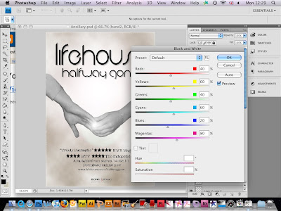
To make the image of the hands black and white, I went to 'Image' and then 'Adjustments' 'Black and White'. This showed the following box so that I could change the preset from default to get the colour that worked best. As the 'preview' box is selected, it showed the changes in colour of the image without having to keep closing the setting.
 Once I had inserted the text into the poster, I wanted to edit the layer style so that I was able to add a drop shadow.
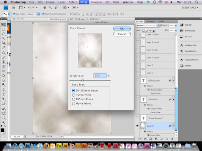
  Once I had the background that I wanted by using the 'Filter', 'Render' and then 'Clouds' to get the effect, I added a lens flare so that it added a nice effect. I was able to position it where I wanted and change the lens type/brightness.

Here are some screen grabs of the important stage to creating the final poster.
To make the image of the hands black and white, I went to 'Image' and then 'Adjustments' 'Black and White'. This showed the following box so that I could change the preset from default to get the colour that worked best. As the 'preview' box is selected, it showed the changes in colour of the image without having to keep closing the setting.
 Once I had inserted the text into the poster, I wanted to edit the layer style so that I was able to add a drop shadow.
  Once I had the background that I wanted by using the 'Filter', 'Render' and then 'Clouds' to get the effect, I added a lens flare so that it added a nice effect. I was able to position it where I wanted and change the lens type/brightness.
Monday, 17 January 2011
Magazine Advertisement Research:
As part of our ancillary task we have chosen to create a magazine advertisement for the digipak. This will be promoting and showing the release of the song we have made a music video for. I have been researching different music advertisements that are around, however I struggled to find many examples that were relevant and could influence our advertisement.
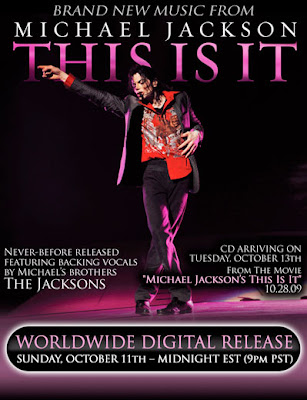

Both adverts have just one main image in the centre of the page which clearly shows the artist. Also, the artist name and title of the song being released is shown through bright colours and bold writing so that it is clear to the reader as soon as it is looked at. From this research, it has encouraged us to want to find a font that is different to normal writing, which stands out well and attracts its audience. The bottom advertisement for Ellie Goulding's 'Lights', has star ratings from the press. I think this is a nice addition to the advert as it praises the song and provides reassurance to people to listen to the song.
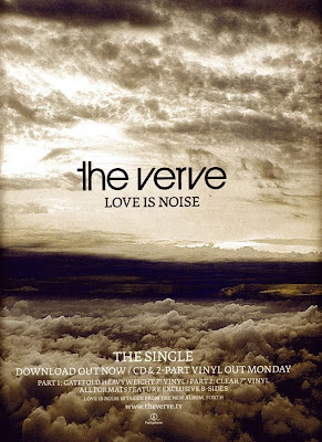
As well as looking at the two posters with the artists on the front, I was able to find the above advertisement for 'The Verve' which looks simple yet very detailed. I will be taking into consideration the different aspects of the different posters, and incorporating these into the designing of our magazine advertisement.
Monday, 10 January 2011
Filming Pictures
We took some pictures whilst filming our video. 
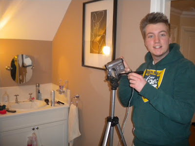
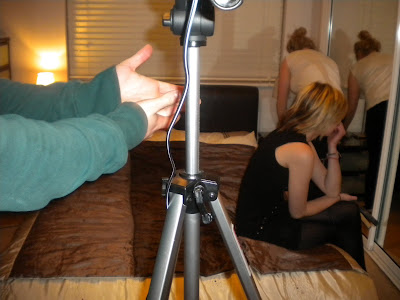


Filming - Take 3:
After putting together the footage from the previous two filming sessions, we was able to see and create a list of what was left to be filmed or what needed re-filmed. This was quite a successful day because we was able to get a lot of good filming done. Using the list that we had made, we was able to get everything done that we needed too in a reasonable space of time. We will put this filming onto the computer and see if there is anything else that we will need to do in one final filming session.
Subscribe to:
Comments (Atom)
